

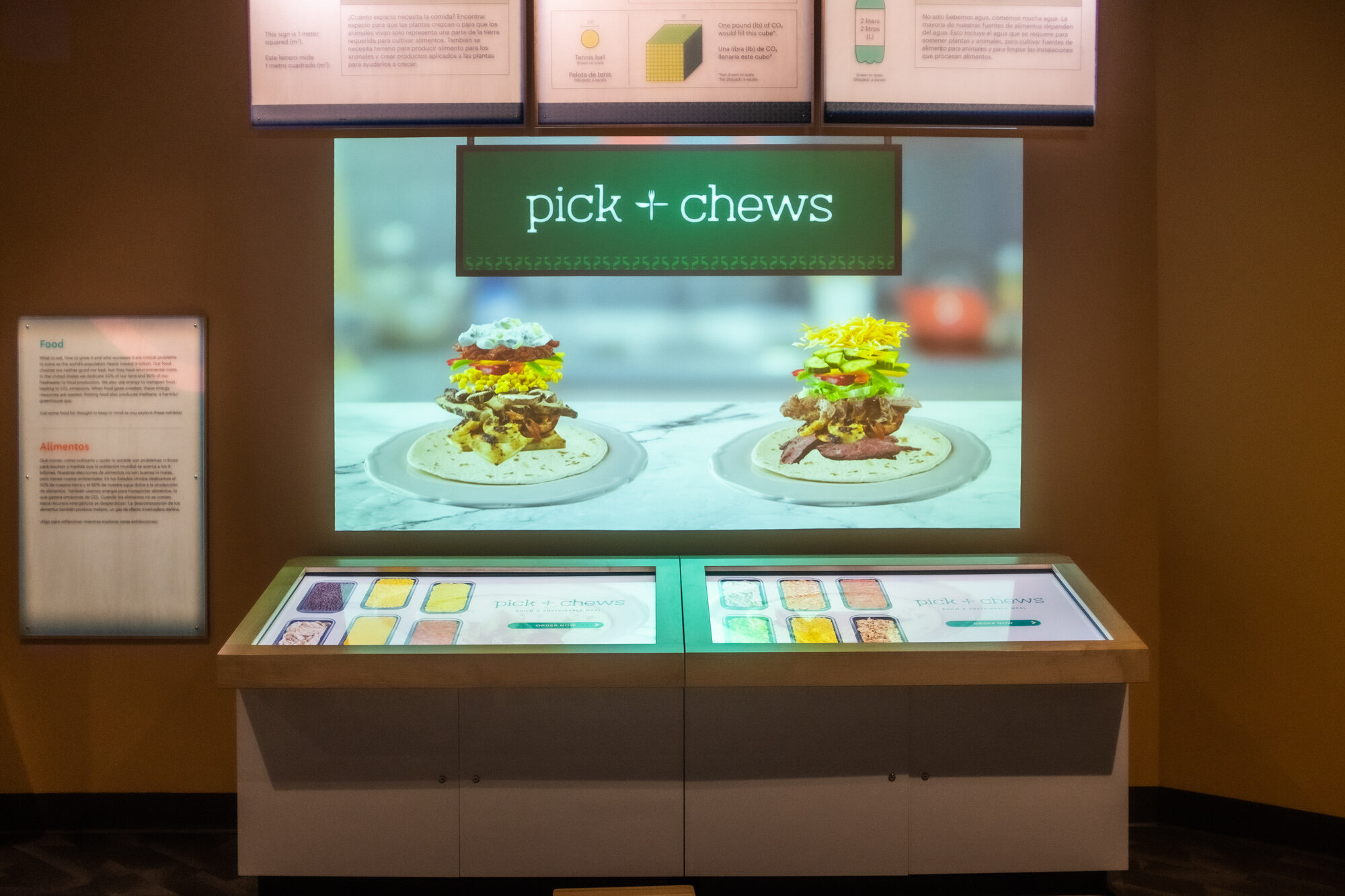
The projections above the touchscreen kiosks show real-time addition and removal of ingredients.

Branding, UI/UX Design
Pick + Chews: Playing with Food
How might an interactive experience help people learn about the environmental impact of their food choices?
Pick + Chews is an interactive experience in Solve for Earth, The Tech Interactive’s new exhibition that explores the relationship between technology and environmental sustainability. Modeled after a burrito bar, Pick + Chews offers fun facts and real data about the ingredients’ environmental impacts as visitors build their meals. Through metric comparison and iterative gameplay, visitors of all ages have the opportunity to learn how to make more sustainable food choices in their daily lives.
The Task
In close collaboration with exhibit content developers and software engineers, our challenge was to transform a rough prototype into an immersive digital experience for both the gallery floor and the web. From its user interface components to the branded materials of this fictional restaurant, I am responsible for every visual element of Pick + Chews. I feel the most ownership (and pride) over this immense project over any other thing I’ve had the privilege to tinker with at The Tech Interactive; I am most relieved to finally let this one into the wild.
The Outcome
Since May 2021, visitors to Solve for Earth have been able to play with Pick + Chews in testing mode. Despite some minor bugs, the experience has garnered very encouraging feedback, including anecdotal evidence of behavioral impact. We aim to improve Pick + Chews, and even launch a web version in conjunction with lesson plans about agriculture and food sustainability.
How might we promote eco-friendly behaviors without shaming visitors for making less than sustainable decisions?
The origins
Plenty of factors influence our decision-making when it comes to food: cost, convenience, habits, ideas around health, and the media are just a few. The exhibit developers at The Tech Interactive recognized that for many, these decisions are accompanied by a high potential for guilt or shame. So they set out to design a digital interactive experience that would allow every visitor to freely explore the various environmental impacts of food choices with the following goals in mind:
Trade Offs: Visitors will be able to compare environmental footprints (water usage, land usage, and carbon dioxide emission) by choosing certain foods over others.
Environmental Sustainability: Visitors will become aware of the environmental impacts of our current agricultural systems and realize the benefits of choosing a more sustainable lifestyle.
Recognize Interconnectedness: Visitors will be encouraged to think of the level of systems and realize the extent of their food choices.
Acknowledge the Power of the Individual: Visitors will feel empowered to solve a current issue by making informed decisions based on real data.
From these goals, the “Burrito Bar” experience was born.
The Predecessors
By the time I was brought on board, Burrito Bar was a working digital prototype that was ready for visual design. Low-fidelity prototyping with visitors (elementary and middle school children with their families or school groups, adults, and staff members in their 20s and 30s) revealed the following insights:
Visitors responded positively to the familiar and fun setting of a burrito bar and were able to relate this experience to the real-word scenario.
In addition to real numbers, visitors wanted visual comparisons of the environmental impacts of food items, as well as points of reference to make sense of the metrics.
To further engage visitors and encourage iterative thinking, the experience needed game-like challenges.
Building the Pick + Chews brand
Visitors responded positively to the familiar and fun setting of a burrito bar and were able to relate this experience to the real-word scenario.
We aimed to construct an environment that mimicked a real restaurant, as visitors found menus and other dining objects delightful and immersive. For a long time, the working title of this experience was “Burrito Bar.” However, we renamed the experience to Pick + Chews to be inclusive of food options beyond the burrito. The new name aptly alluded to the visitor goal of making trade offs, and followed the “Thing & Other Thing” naming convention of James Beard award-winning restaurants. I chose to stylize the ampersand as the plus sign to reference the action of adding ingredients to the meal.
Once the name was finalized, it was time to design the logo of Pick + Chews. I was fairly uninspired until I began researching dining etiquette out of curiosity. The eureka moment arrived when I learned that placing the fork on top of the knife perpendicularly, in the shape of a plus sign, signaled “ready for seconds.”

My first mockups utilized coral as the dominant color for UI components, which was eventually replaced with a dark green. This change provided stronger color contrast and evoked the green tiles of nice salad bars I’d seen on Pinterest. You’ve likely seen the typefaces I‘ve chosen on real-world coffee shop menus (and craft beer cans). I wanted the brand to be timelessly hip, yet exude an air of modern eco-friendliness.


From prototype to final product, the evolution of a card
In addition to real numbers, visitors wanted visual comparisons of the environmental impacts of food items, as well as points of reference to make sense of the metrics.
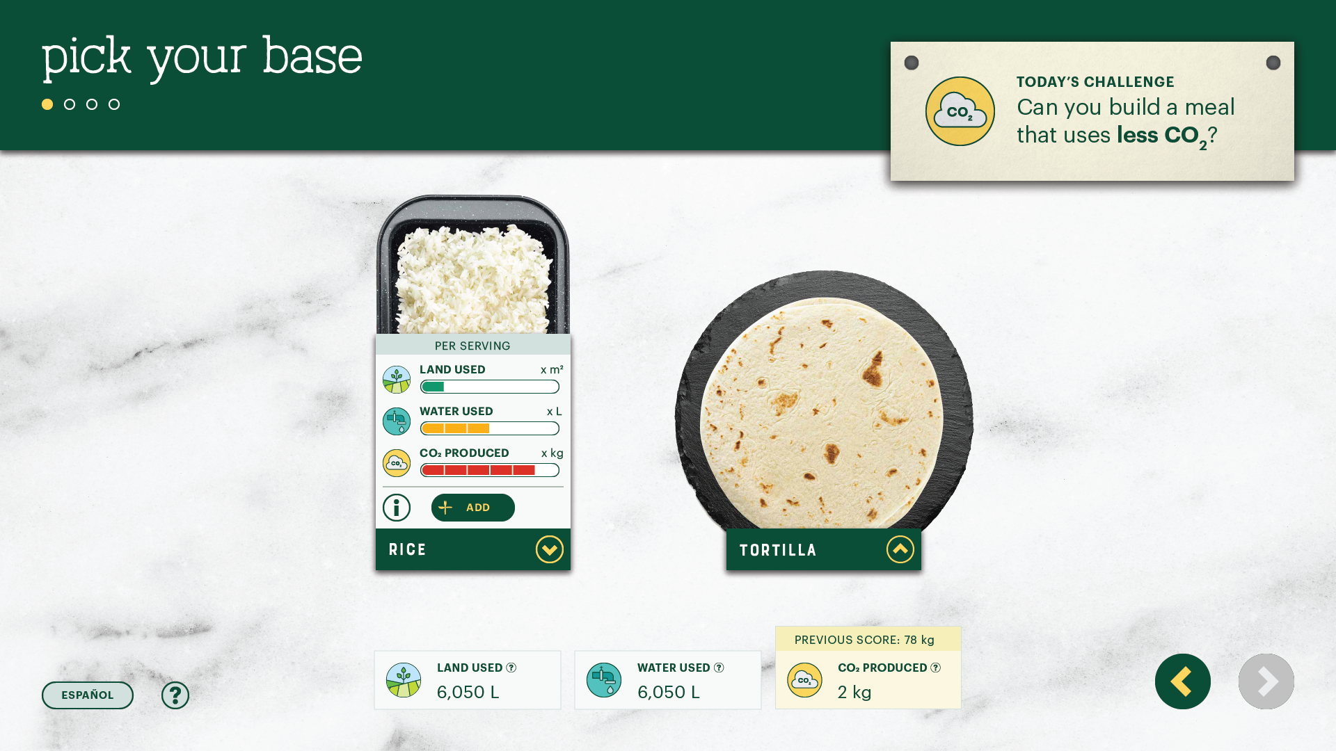
The first prototype posed several areas for improvement. Each ingredient card required space for a fun fact, and prototyping sessions indicated the need for graphic visualization of the footprint metrics. Space was the most significant constraint; all touch targets had to reside in the lower two-thirds of the extra large screen for reachability.


My first pass recycled the 3x2 layout, but introduced colored meters to display scales of footprint: 1-2 bars for low impact, 3-4 bars for medium, and 5-6 for high, all relative within each ingredient group (comparing the environmental impact of steak to corn would break the scale). I added color to provide a second mode of visual comparison. The colored meters were well-received, but following issues remained: the text was far too small, and the contrast between the coral and white did not meet accessibility standards.
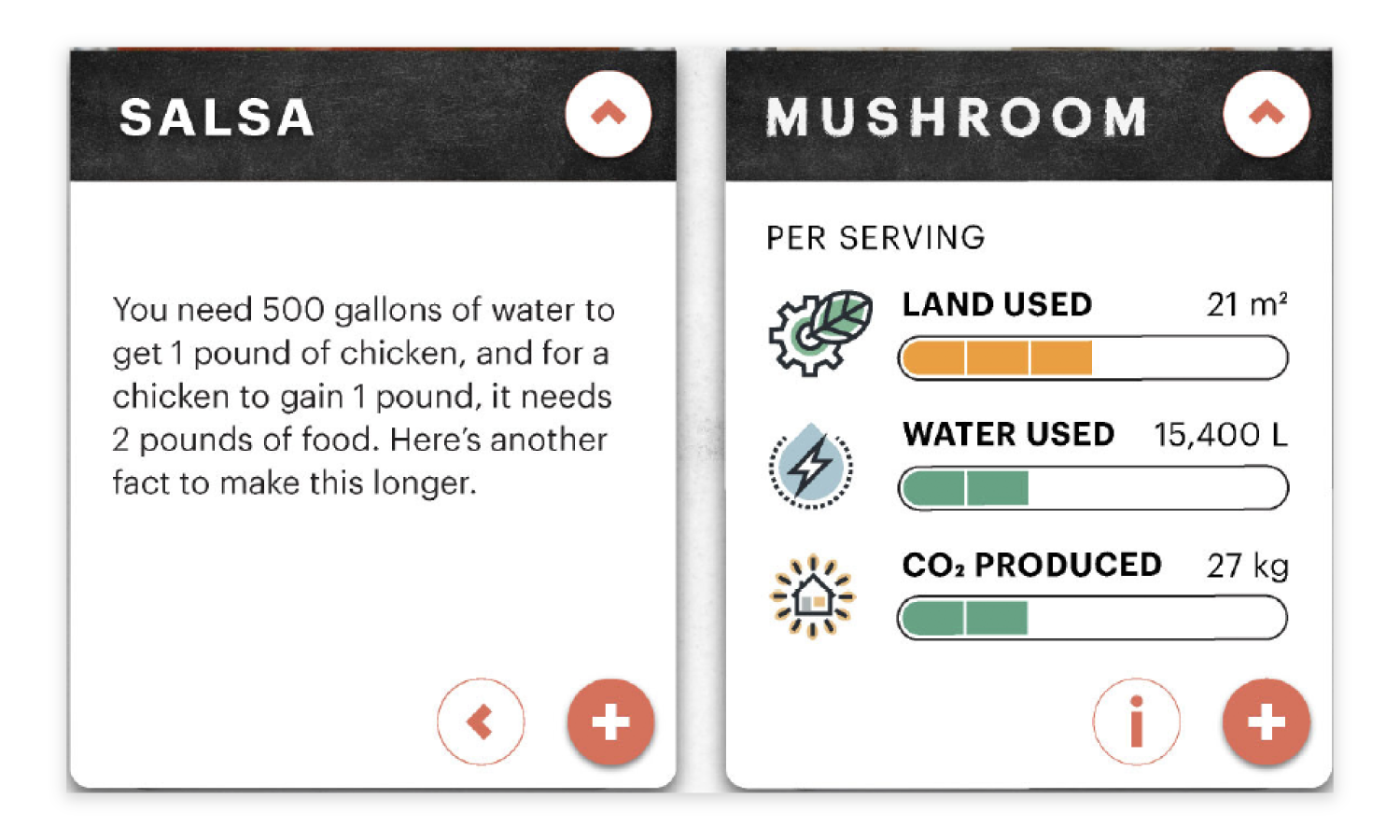

Quickly moving on to the next design, I rearranged the layout to a 6x1 grid to allow horizontal comparison of the metrics and easy access to the touch targets. To make space for the challenge mode, I shrunk the header and relocated the instructions to the top left. I also proposed a drop-up card that flipped to show the fun fact on the other side, with icons replacing the text buttons. Unfortunately, testing revealed insufficient padding between the two buttons on the lower right.

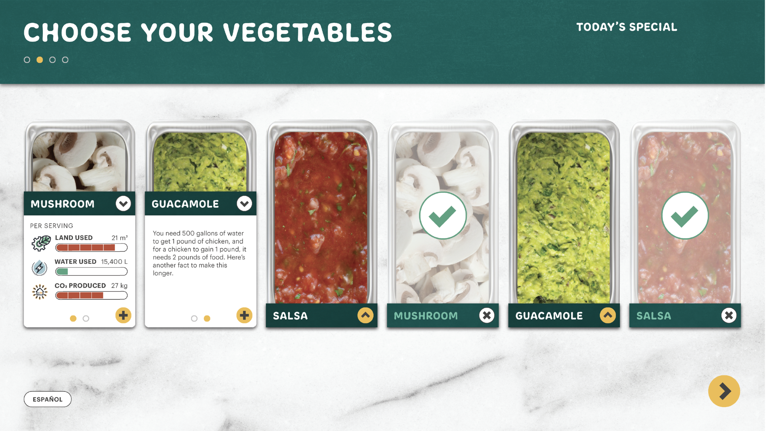
While the color scheme and layout were headed in the right direction, the card design remained complex. Here, I entertained the idea of removing the information/back buttons and implementing a carousel-swipe. Our priority was to get users to add ingredients and build at least one meal; the fun fact was optional. We tossed this iteration.


Through visitor testing, we learned that users often felt frustrated that the drop-down button was not in the same location as the drop-up; they kept hitting the add button when they intended to close the card.

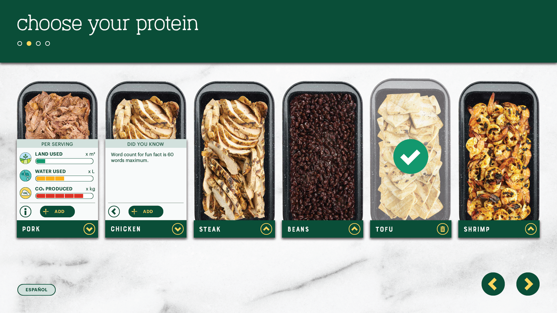
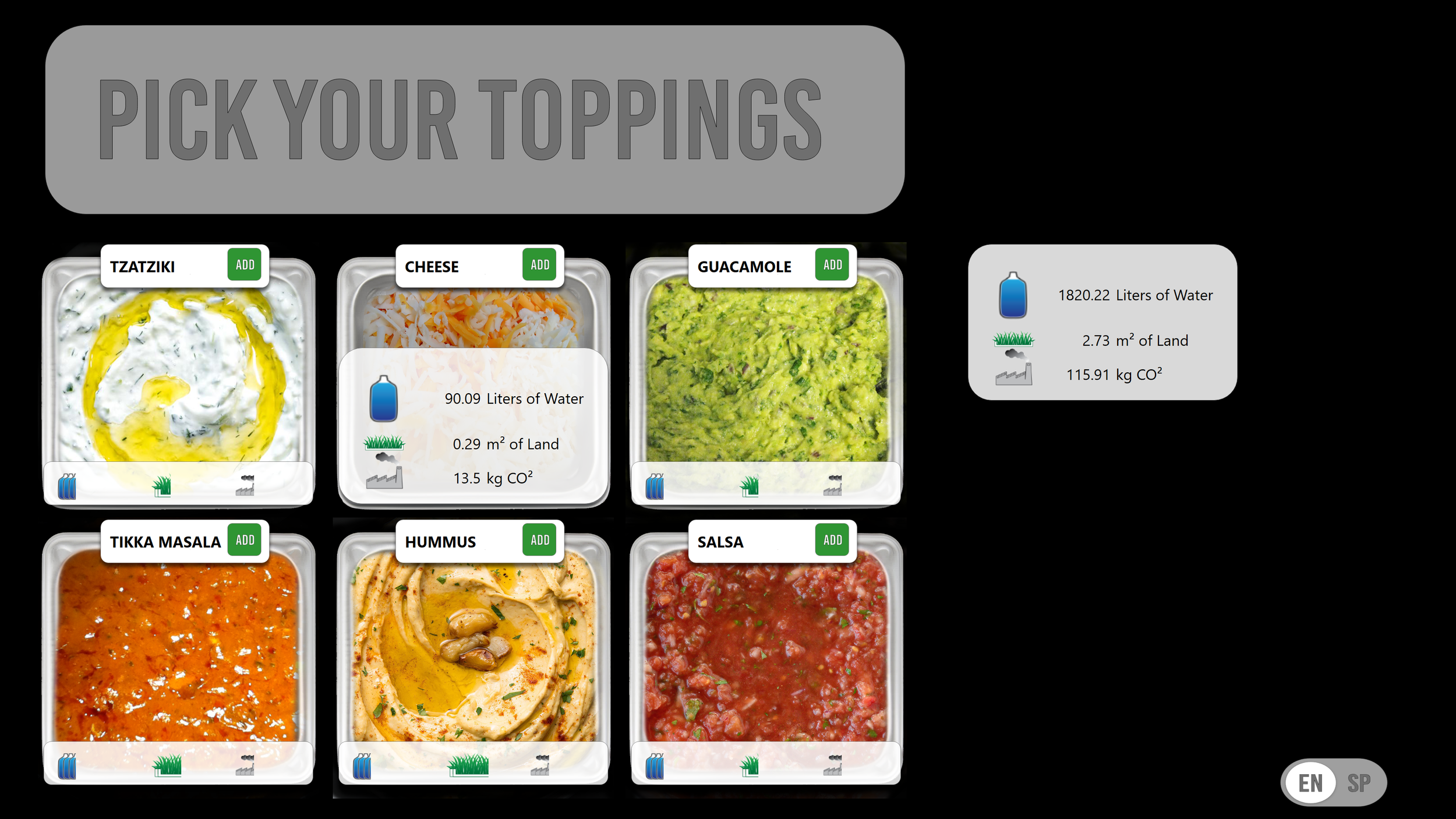
The final design incorporated the fictional brand guidelines of Pick + Chews, and addressed the prior user frustrations by placing the drop-up and drop-down buttons in the same location. I also emphasized the add button by making it larger, and moving it to the front and center of the card. In the end, we implemented a tutorial mode at the start of the game to guide the user through the steps of adding an ingredient to their meal.

I included a screen that contains the same information as the physical signage that accompanies the exhibit. A bath towel illustrates a real-world point of reference, as the signs no longer provide physical scale.

The icons used throughout Pick + Chews, including these physical signs that hang above the kiosks, share the same visual language as the Biodiversity Game.

These signs aim to explain the units of measurement for each metric and provide real-world references of scale to visitors.

How to get people to play again, and again
To further engage visitors and encourage iterative thinking, the experience needed game-like challenges.
I had been a proponent of introducing friendly competition to Pick + Chews by implementing a scoring system, until Lisa and Michelle explained that grading the overall environmental footprint of a meal could possibly make the player feel ashamed for their food choices. How could we incentivize users to continue playing?
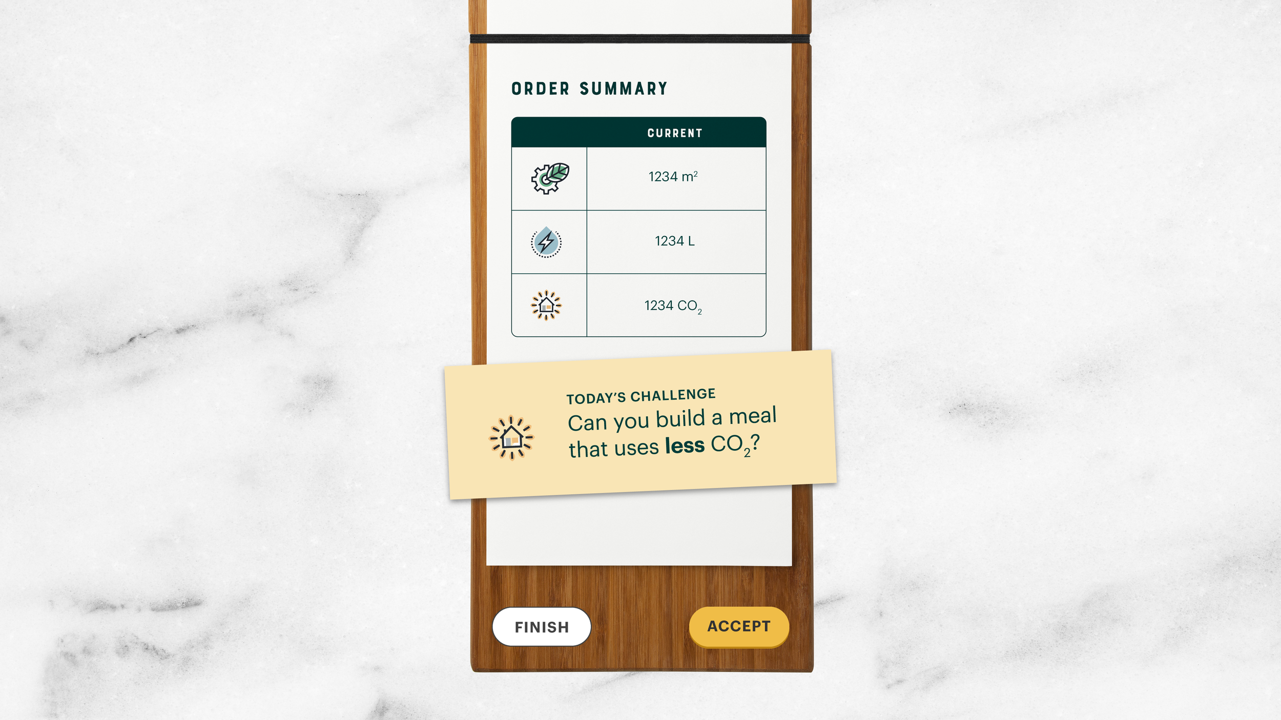
At the end of the first round, the user receives a “receipt” that calculates the total for each metric. A random challenge is generated and offered to the user.
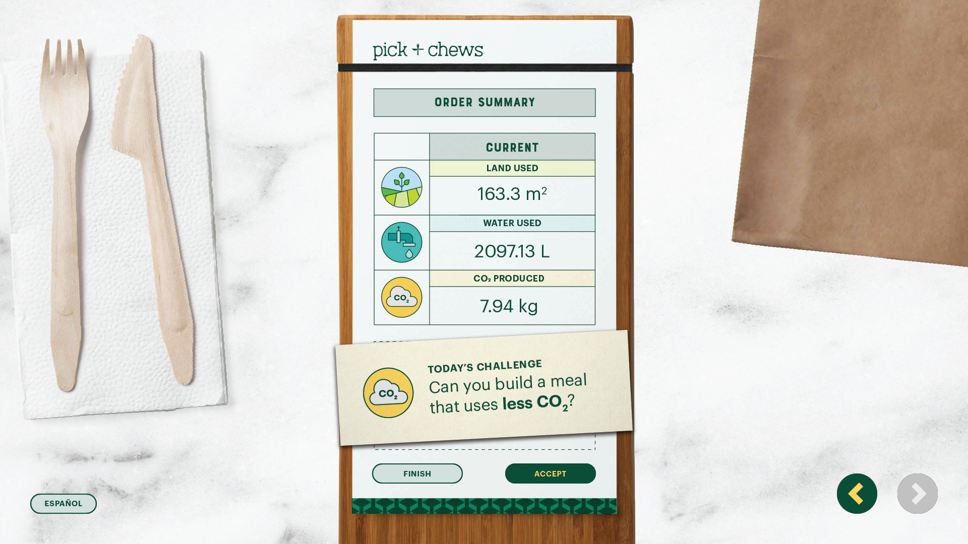
I decided to include a text label for each metric in the final design.
Screens during the challenge-mode show a running total of each metric below the ingredients, as well as a reminder of their challenge posted on the top right.
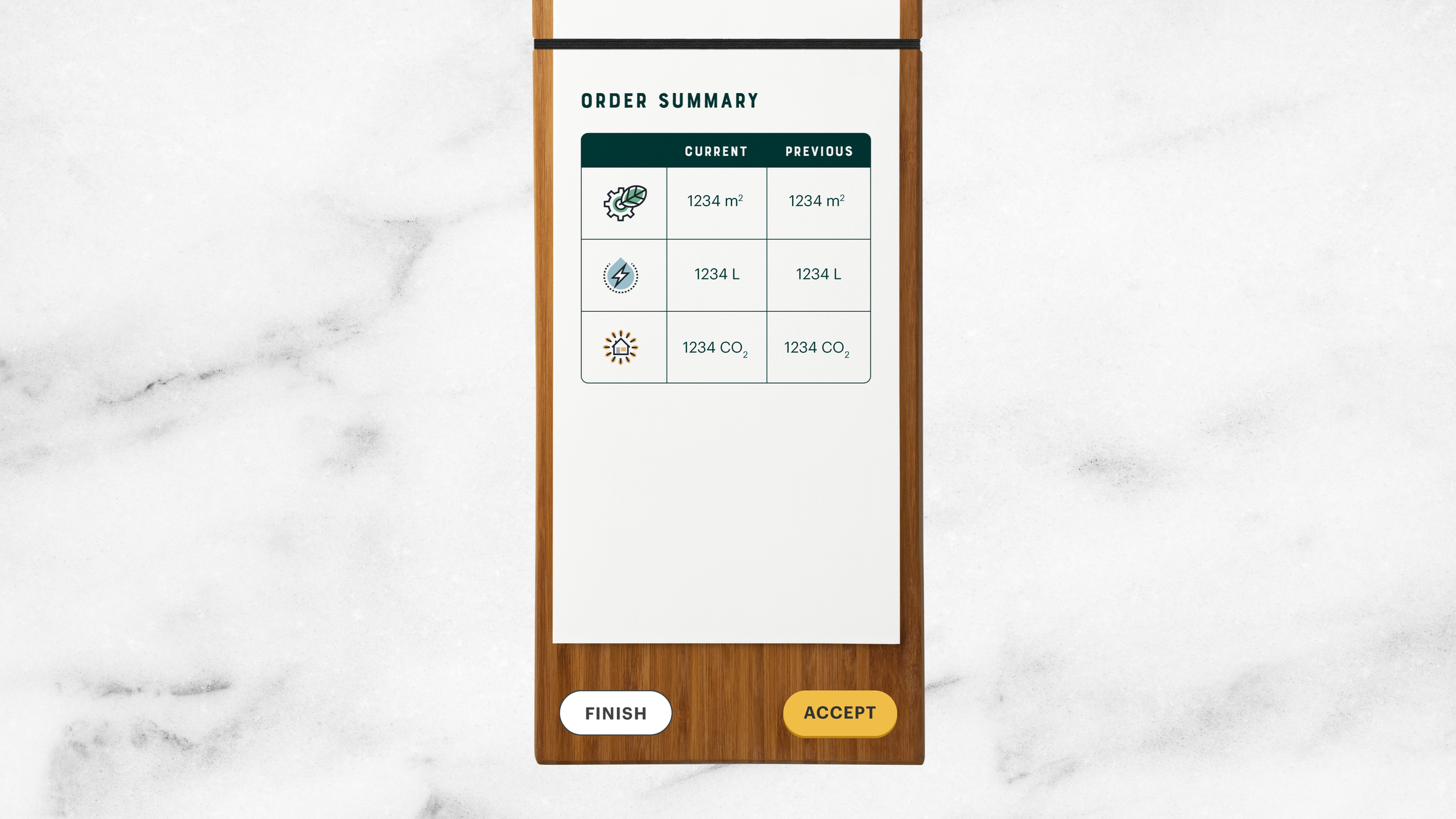
The receipt at the end of the first challenge has two columns of totals, one for the previous baseline meal and one for the current.

We wanted to graphically represent the net change for each metric by adding another column for up and down arrows. Users can accept as many challenges as they wish, before finishing their session.
Epilogue
Pick + Chews has been running for beta testing on the gallery floor since The Tech Interactive reopened in late May 2021. Since then, we’ve already received so much positive feedback, including people saying that they wanted to go to [redacted] after playing the game, and that when they did go, they found themselves changing up their order after remembering the colored meters and metrics of their choices. We are currently surveying visitors for their feedback, so we can improve Pick + Chews to further inspire people to make sustainable food choices.

Pick + Chews, for the Web


The greatest challenge laid in consolidating the two screens (ingredients and assembly) into one, while ensuring readable text, adequately sized touch targets and a working reactive layout. Whew.
The Pandemic Pivot
Like most museums, The Tech Interactive temporarily closed in March 2020 because of COVID-19. This closure spurred the digitization of many of The Tech’s educational resources and hands-on activities, including Pick + Chews for the web. Through developing this version, we intended to determine the feasibility of hosting such digital experiences on our website, as well as to test the design with our audiences. Software engineer Dylan and I struggled for nearly half a year converting the 65” touchscreen experience into something compatible for the web (and possibly for mobile). While Pick + Chews for the web is currently in production limbo, I am excited to share a sneak peek of what we hope to launch and market nationally.

Animated instructions replace the tutorial at the start of the game.

I learned how to provide specs in relative units while designing Pick + Chews for the web; I’d like to thank Dylan for his infinite patience.

In contrast, here’s how I gave Mike specs for the gallery version.
Year
2019-2020
THANKS TO
Prinda, Maria, Mike, Dylan, Dan, Lisa, Eloisa