Branding, Exhibition design
Building a Bright Brand for Solve for Earth
What should an exhibition about technology and environmental sustainability look and feel like?
The Tech Interactive’s new exhibition, Solve for Earth, was to be built in the basement-level gallery that formerly housed exhibits about outer space and earthquakes. In other words, it was dark down there. When budget cuts squashed pipe dreams of biophilic architecture and hydroponic green walls, we had no choice but to rely on artificial lighting and wall paint to revitalize a space that hoped to instill optimism in a time of grim, climate uncertainty.
The Task
During this early design phase, Creative Services was tasked to create a style guide that would inform everything about Solve for Earth, from the color of the gallery walls to the digital interactives housed inside. Balanced. Hopeful. Modern. “Earthy, but not too green!” the Exhibits team urged, never forgetting to remind us that Solve for Earth was not exclusively about the environment.
The outcome
Eloisa, the Senior Graphic Designer, created the logo, while I focused on the color palette and typography of Solve for Earth. Emerging from the Adobe Typekit rabbit hole, I nominated Capriola, a sans-serif with organic, lively gestures, as the display typeface. By default, the secondary typeface went to Graphik, one of The Tech Interactive’s brand fonts.
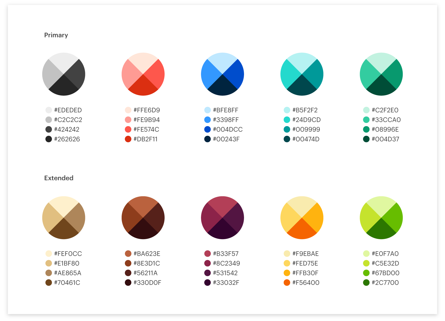
And after spending many days on Pinterest and Coolors, I settled on hues drawn from the local salt ponds and natural materials like clay and wood, with the unavoidable dash of greenery. While the typography was approved without much hassle, picking the color palette was a much more iterative process. I learned the limitations of a one-size-fits-all palette, and instead created two versions: one specifically for success on screens and one tailored for print production. The completed style guide has since been used to design the physical environment including furniture and signage, as well as digital products like Pick + Chews and the website previewing Solve for Earth. Illuminated by an energizing look and feel, Solve for Earth had its soft opening in May 2021.
How to make a single color palette work for both the physical and digital environment, or not
When I was later asked to develop the color palette for Solve for Earth’s digital interactives (or exhibits, as we call them), I copy-pasted from the style guide and promptly shipped the UI design guidelines to our contractors. About half of the palette was reserved for UI components like buttons, and the rest were designated as colors for backgrounds and illustrations. Easy peasy.
But upon reviewing the first round of mockups that followed the guidelines, two things became urgently clear: a lack of proper contrast and the need for predetermined color variations. The first edition of the guidelines had permitted the arbitrary derivation of tints and shades for illustrations and backgrounds, resulting in a dull chromatic jumble. Creating color schemes from this palette, while obviously intuitive for myself, was not so simple for others.
Until this point, I had been largely guided by intuition and principles of print design, unaware of accessibility standards and best practices for UI design. We needed a new, flexible color palette that would perform well on both paper and screen. After modifying the general saturation and brightness, I expanded the palette to include three variations of each core color. For digital use, I tested combinations of tints and shades to ensure their contrast ratios met the Web Content Accessibility Guidelines (WCAG). Finally, I manually matched the closest PMS swatches for the palette’s print counterpart. Positive feedback from our contractors and their subsequent mockups demonstrated the versatility and vibrancy of the new selection of tints and shades.
Year
2019
Thanks to
John and Sierra


