UI Design
The User Interface of Solve for Earth
What goes into crafting a cohesive digital experience?
When I joined The Tech Interactive (formerly known as The Tech Museum of Innovation) in 2018, Solve for Earth was an exhibition concept several years in the making that was internally called Technology and Sustainability. While the exhibition has since been renamed Solve for Earth, its goals have remained unchanged: to examine the interconnectedness of our communities, the environment and technology, and to inspire guests to take action to live sustainably.
The task
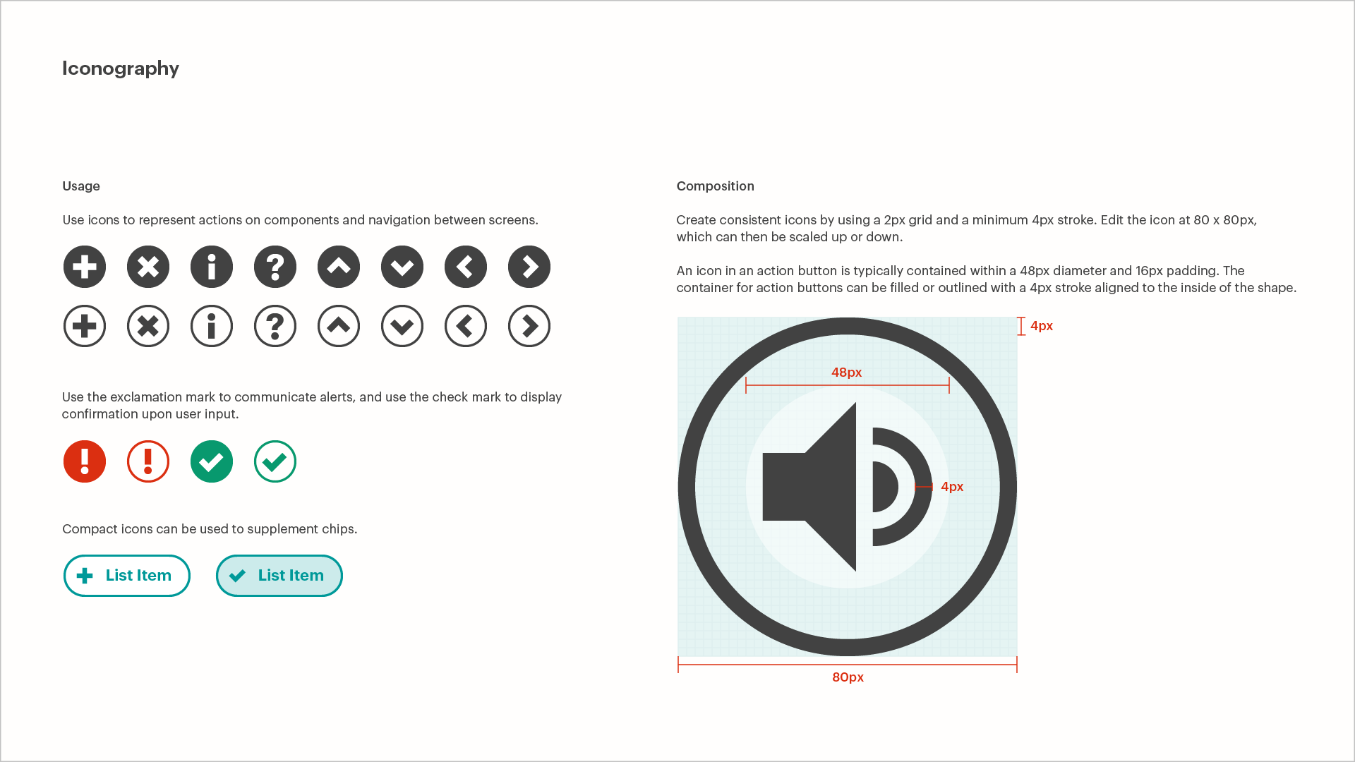
Many of the hands-on activities at The Tech Interactive are digital experiences (referred to as exhibits hereinafter) on large touch screens. While a handful of Solve for Earth’s exhibits had been contracted to design studios, most were to be developed in-house by two software engineers and myself. To unify these various platforms, I was tasked with creating The Tech Interactive’s first user interface design guidelines.
The Outcome
In close partnership with the Exhibits team, I developed this document along with shareable assets that have guided the collective efforts of designing a family of digital experiences for The Tech Interactive. Beyond Solve for Earth, video kiosks for The Tech for Global Good and The Tech Challenge have also benefited from these design guidelines. I am happy to report that Solve for Earth had a successful soft opening in May 2021.
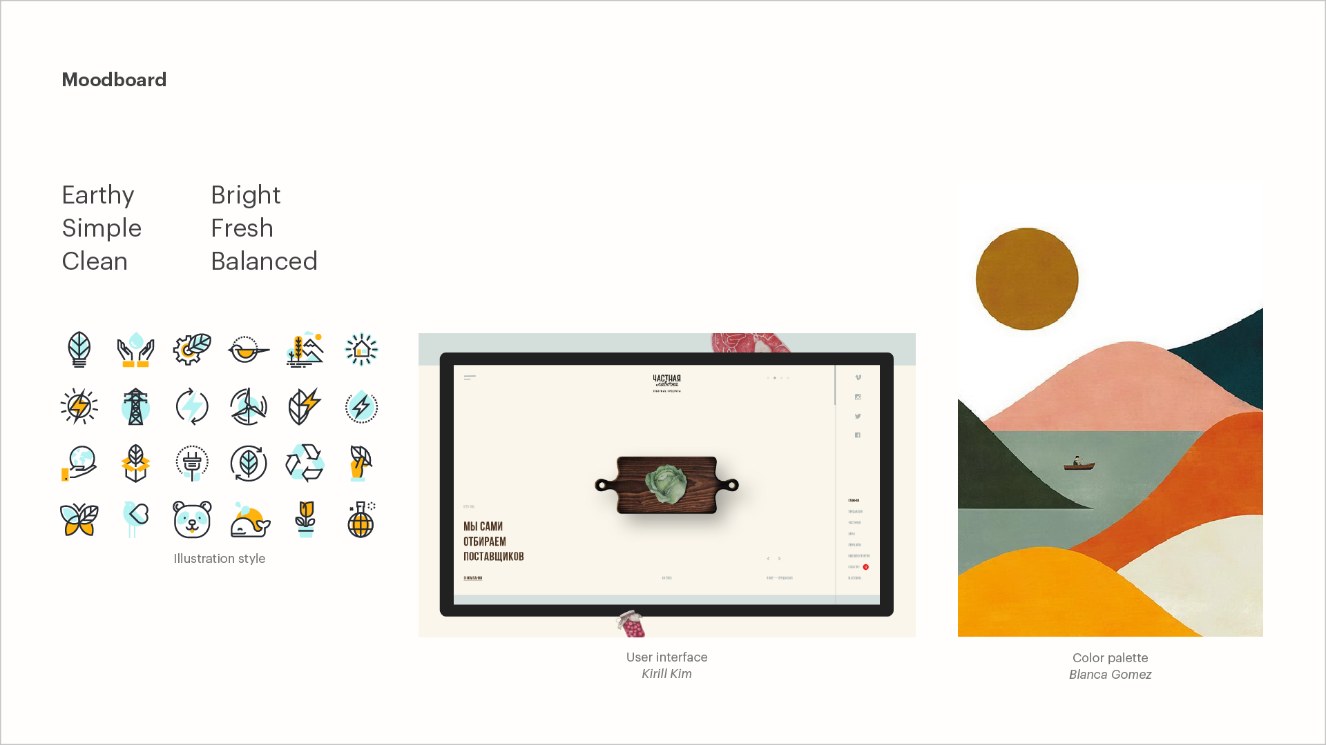
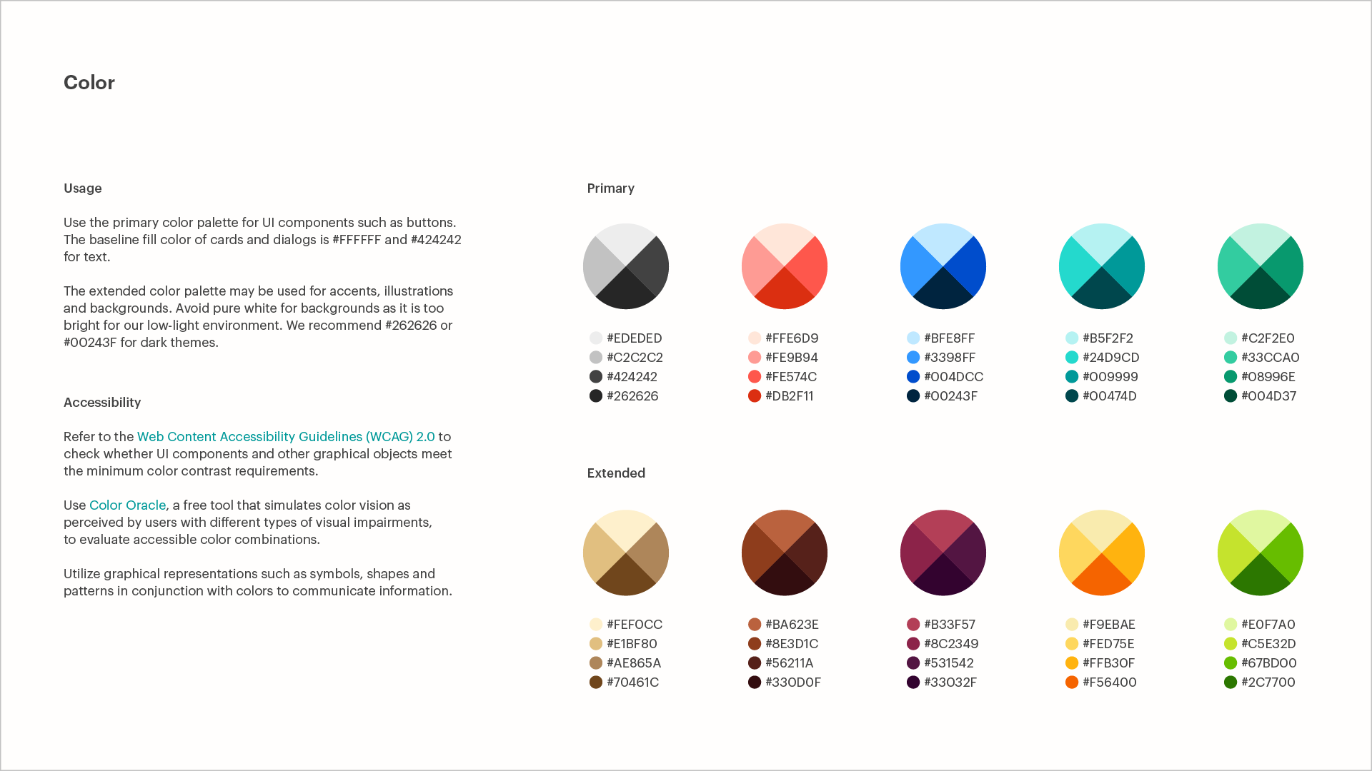
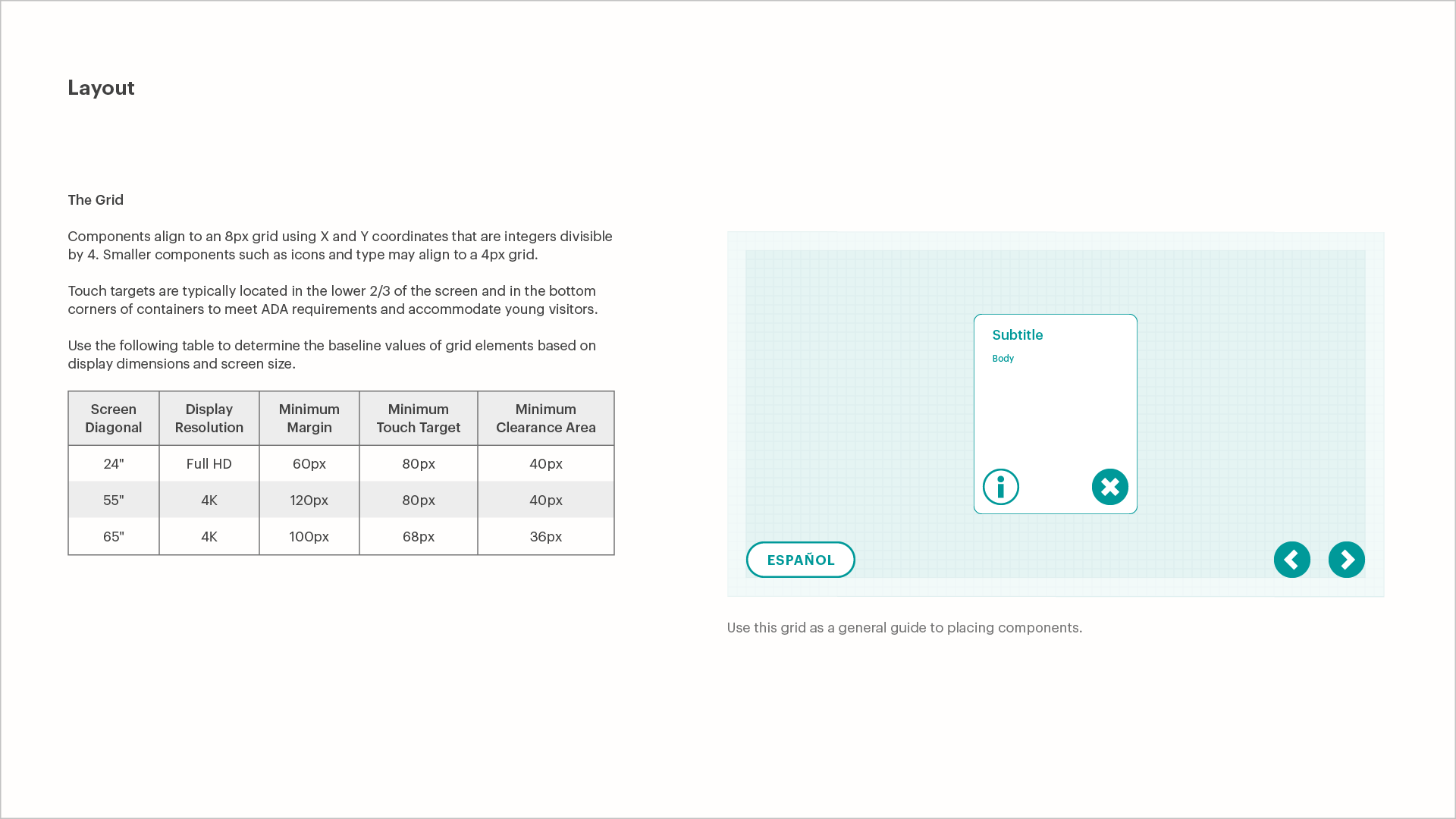
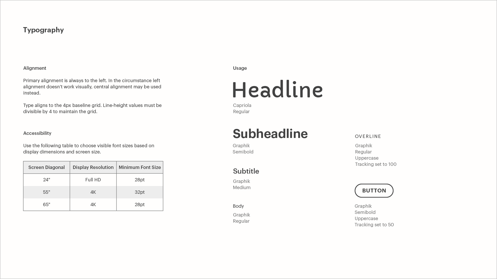
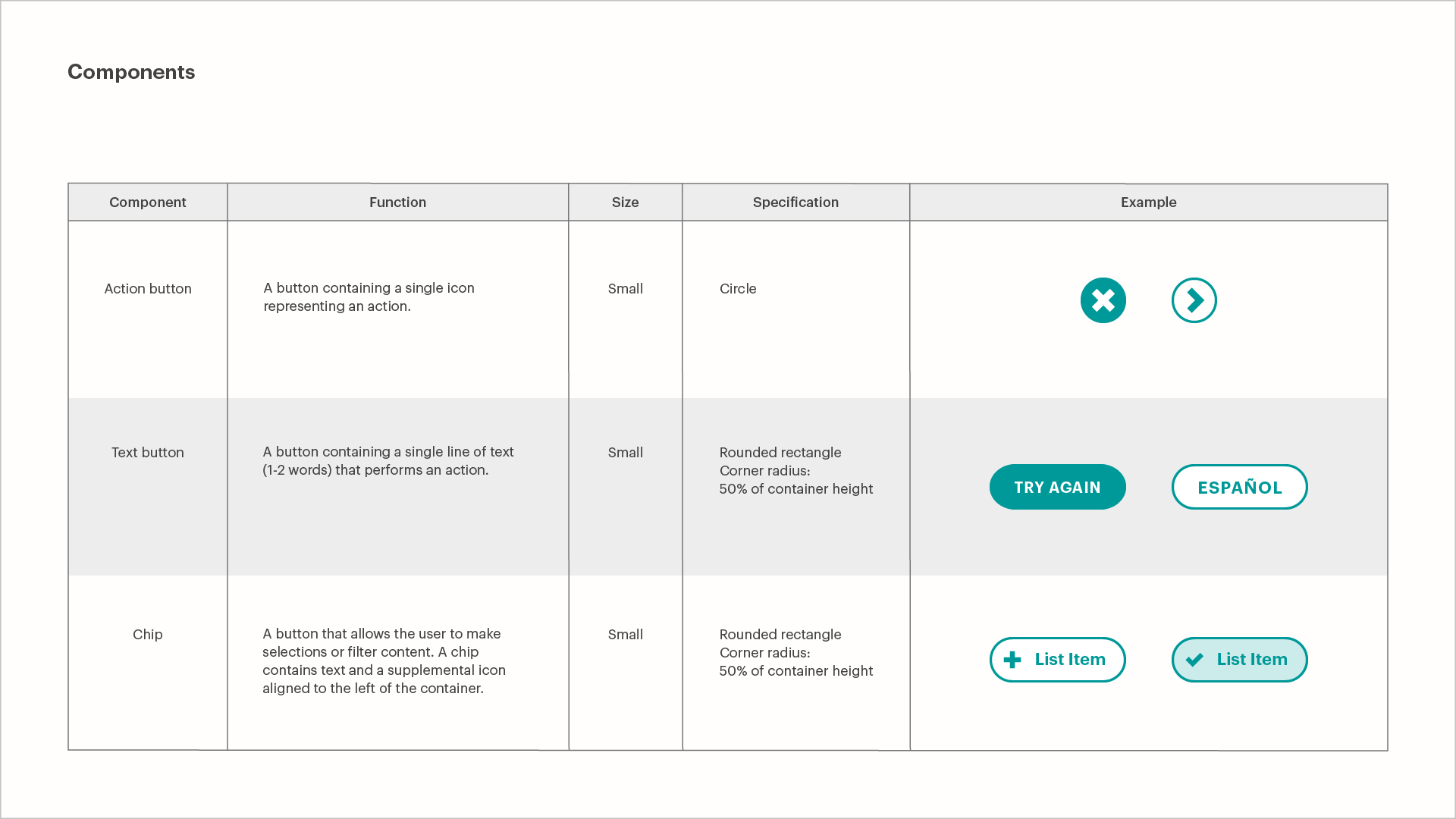
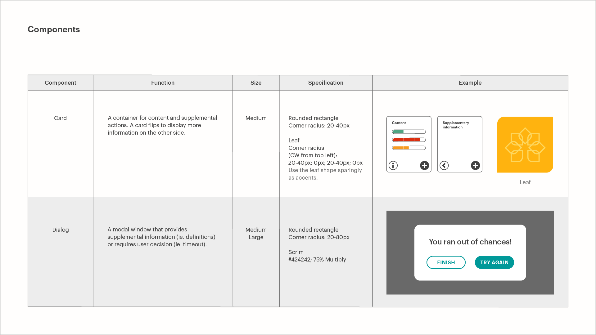
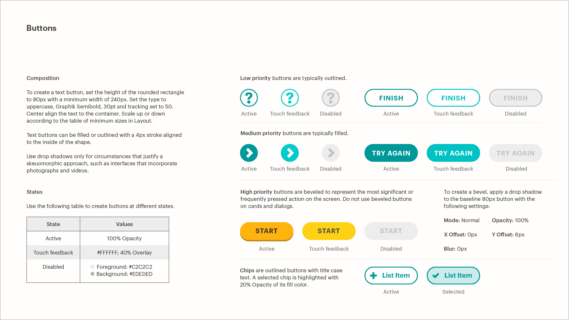
And what goes into developing user interface design guidelines?
At the start of this project, I had already created an exhibition style guide that touched on color and typography. But a cohesive digital experience would also need guidelines on layout, components, iconography, and language. As The Tech Interactive’s freshly promoted—and very first—visual designer, I had little confidence with UI/UX design. It was time to learn, by copying the masters.
I studied the guidelines of design powerhouses like Google and Apple (Headspace was another constantly opened tab). Then, at Exhibits’ behest, I jumped straight into designing three exhibits that had functional but rough prototypes. The idea was that simultaneously designing these interfaces would help us anticipate what required guidance and reveal common UI solutions.
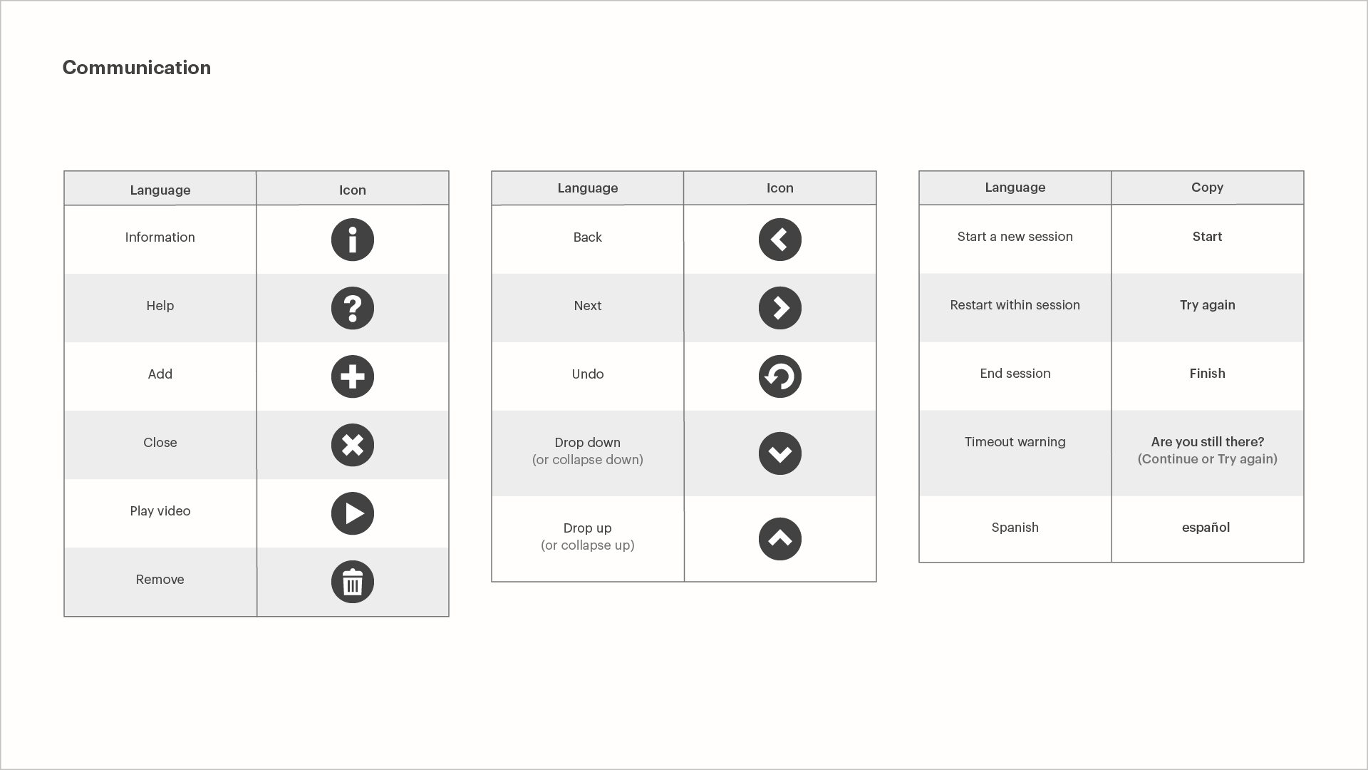
Luckily, color and typography had already been accounted for. With help from exhibit design directors Dan and John, we tested and determined the minimum sizes of fonts and touch targets that would comply with ADA requirements. I chose the popular 8px grid, and advised touch targets to be placed on the lower two-thirds of the large format displays to meet ADA standards and accommodate smaller and younger guests. UI components such as buttons and cards were adapted from Material Design, which I admired for its simplicity and ubiquity. Having witnessed both “end” and “finish” buttons used in the prototypes, I worked with Exhibits to compile a list of recurring UI/UX copy and assign equivalent iconography.
Three designed user interfaces and six months later, we shipped the Solve for Earth UI Design Guidelines to our contractors, along with Illustrator files containing sample buttons and icons. Through developing these guidelines, I learned about design systems and UI best practices, and introduced a common vocabulary that my colleagues, outside partners, and I could share as we built Solve for Earth.
Epilogue
During the development of the UI guidelines, I primarily worked with a software engineer who uses C# and requests PNGs and fixed pixel coordinates for assets. When The Tech Interactive temporarily closed in April 2020 due to COVID-19, we began converting some of the Solve for Earth exhibits as online experiences. That was when I started working more with the other engineer, who uses JavaScript and prefers SVGs and specs in relative units. While some sections of the UI design guidelines are not suitable for responsive web design, this document, largely responsible for my visual design education, continues to check for creative consistency in my work for Solve for Earth.
Year
2019
THANKS TO
Dan and Eloisa


